Sullivan Branding
Sullivan Branding required a home that would allow its team members to express their brand within their workspace.
Located in an historic office tower downtown, the leased shell space is broken into two distinct pieces by the building's lobby. On the larger side, the space was populated only by the original bell-capital concrete columns. The account staff's workspace in the smaller section was the former Memphis Redbirds Store and came with many prominent architectural features. The decision was made to leave the existing forms to save cost.
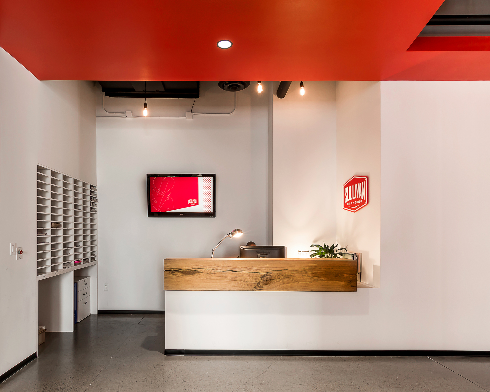
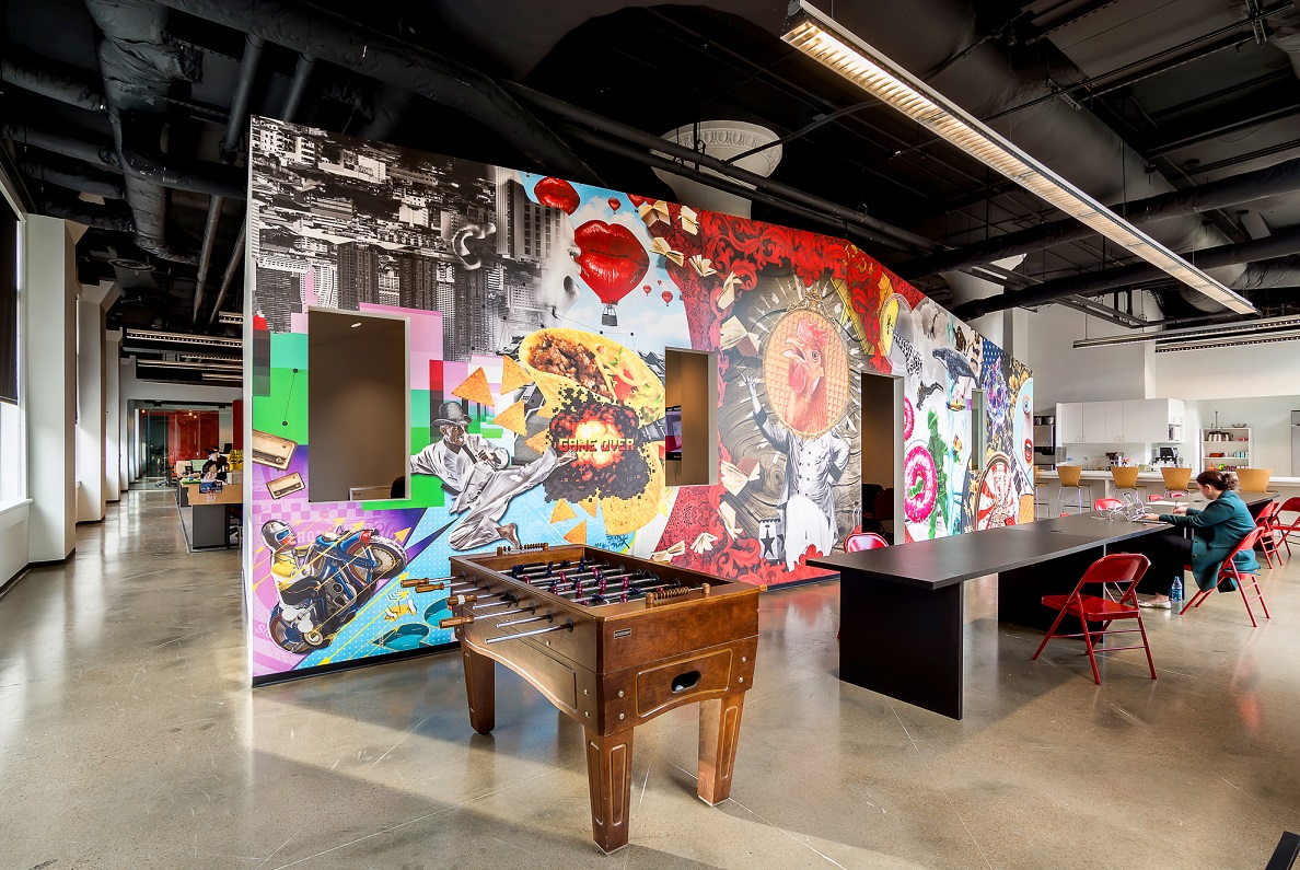
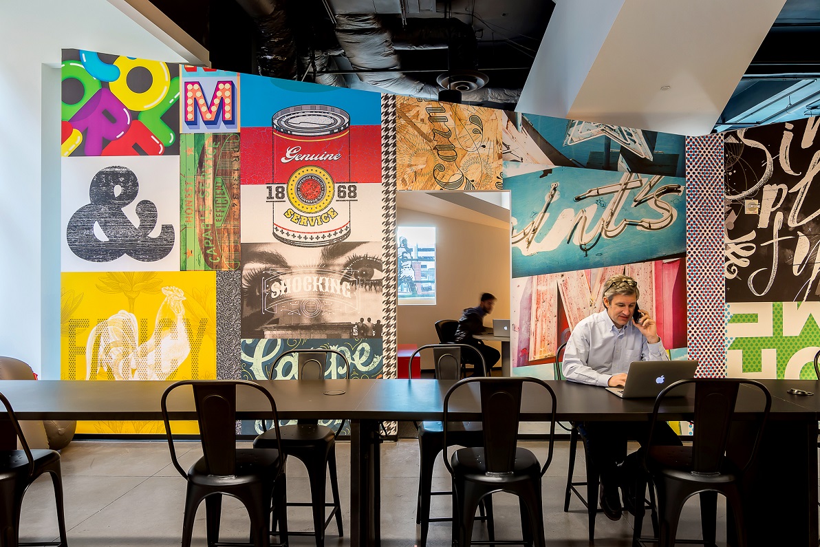
Within the framework of these disconnected volumes, we inserted layers of space-defining elements inspired by the brand, identity, and goals of the agency. Programmatically, two open office spaces were required. To promote collaboration and camaraderie, simple and inexpensive communal desks with veneered plywood details delineating individual workstations are built-in, bringing a natural grain into the spaces. A red plane of painted drywall housing support spaces weaves throughout the office, connecting both spaces. This bold red element is tempered by two faceted volumes, housing smaller private meeting areas. Each volume, wrapped in the agency's work with massive vinyl graphic collages, is placed to divide the open space and serves as a focal point in the workspaces and from the street. Monumental collaboration tables inhabit the spaces between as informal, impromptu meeting spaces. All four elements - the communal desks, the red plane, collaboration tables, and the faceted graphic volumes - work to provide an invigorating, adaptable workplace for a growing company.


