Aurora Collegiate Academy
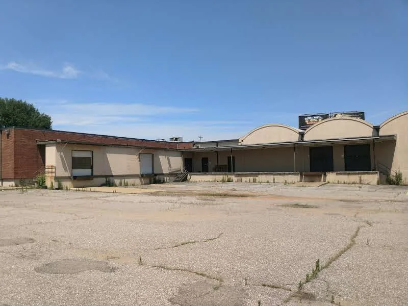
The design team relied on deliberate, minimal design moves, and creative use of inexpensive materials to meet the strict budget requirements for the project while also creating a significant impact. The existing site consisted of a simple, 1960s era brick office building, with a barrel-vaulted concrete warehouse addition attached to the south end of the existing building. The exterior of the building was largely untouched, spruced up by cleaning and new paint, but the interior was transformed entirely, creating a jewel box along the busy Summer Avenue corridor.
The northern half was almost entirely gutted to maximize the use of the space for classrooms and offices. Most were concentrated along the perimeter to allow each room to have access to natural light. The few rooms located in the center of the building were illuminated with daylight as well, by punching skylights through the roof. The classrooms are connected by color-coded corridors, which allow for easy access and wayfinding from any part of the building.
Most spaces such as classrooms, offices, and the gymnasium were brightened up with either crisp whites or natural wood tones, but pops of modern colors were used sparingly in key areas to make the most impact. These colors help with subtle wayfinding by coding similar areas, such as administrative areas in golden yellow or restrooms in turquoise. One of the clearest examples of the use of color for wayfinding is in the lower level parking area. The monumental staircase is painted out entirely bright orange. It leads users down to the parking level, where they are met with an explosion of complementary colors, clearly delineating pedestrian zones and drive aisles to ensure the safety and organization of the parking and drop off area.
Overall, the project relied on deliberate, minimal design moves and the creative use of inexpensive materials to meet the strict budget and time constraints, thus creating a major impact on the site and the future of Aurora Collegiate Academy.


